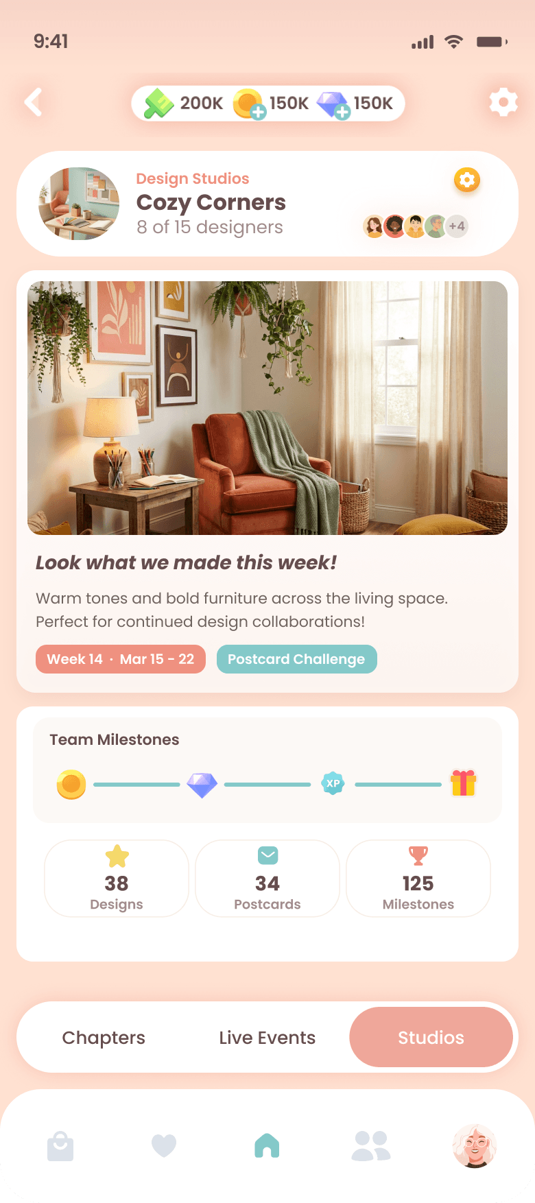
Design Studios
4 million players designed alone.Belonging had to feel like a warm room.
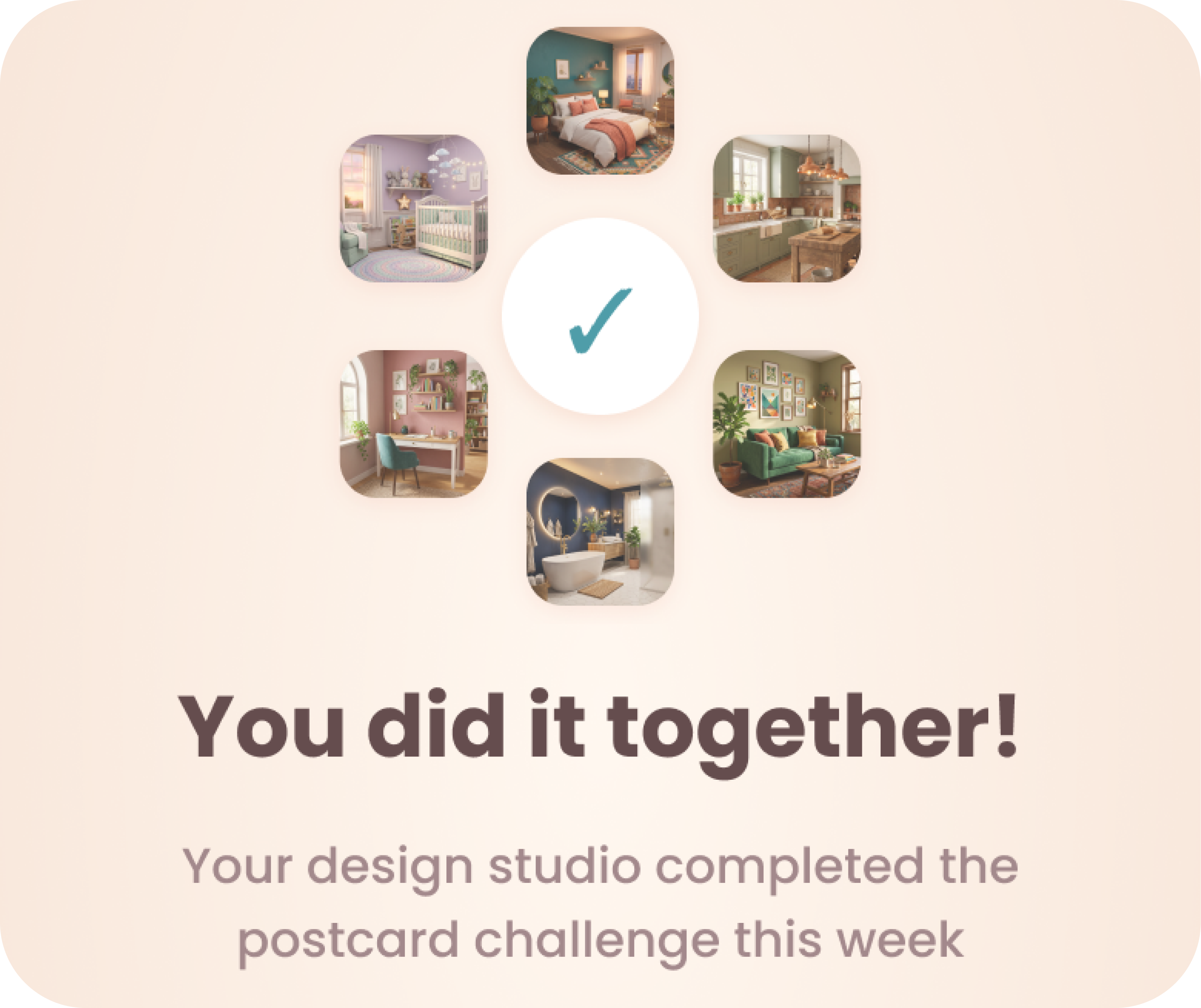
A 30,000-person Facebook group proved players didn't want to design alone — they wanted to celebrate each other's work. Research, frameworks, and a 19-screen prototype for a social feature that had to feel like home, not a competitive ladder — built in three weeks.
Context & Challenge
Venue is a mobile interior design game with over 4 million downloads and a player base that's roughly 90% women, 25 and older. The core loop is satisfying: design a room, submit it for anonymous peer voting, wait two hours, get a star rating.
But every emotional peak in that loop happens alone. The pride after submitting something you're proud of. The anxiety during the two-hour wait. The validation — or sting — of the score. Nobody sees any of it.
Then there's the Facebook group. 30,000 players built it themselves. They weren't asking for chat features. They were sharing designs, celebrating each other's rooms, and doing what the app never gave them space for: belonging to something bigger than a star rating.
Emily, the founder, had a clear north star: D30 retention through social attachment. Not engagement tricks. Not notifications that guilt you into opening the app. The kind of attachment where a player still wants to open Venue in a month because she feels part of something warm.
The Design Challenge
Build a group social feature for a game whose brand is calm, elegant, no pressure — without turning it into a competitive guild. No chat. No streaks. No "last active" timestamps. No leaderboards. Understandable in 10 seconds. Woven into the existing game loop.


30,000 players built a community the app never gave them space for.


MyRole&Approach
This was a three-week design sprint coordinated by Yummy Labs in partnership with Superbloom and their founder, Emily. I owned the full design arc — research through prototype — working from a shared brief while making every framework, screen, and pixel decision independently — with Claude and his codes as my copilot.
Phase 1
Understand
Game audit, player psychology, alignment
Phase 2
Frame
JTBD stories, KPI mapping, constraints
Phase 3
Explore
6 wireframes, reference analysis, hybrid
Phase 4
Build
36 components, 19 screens, prototype
Phase 5
Present
Narrative, walkthrough, phased roadmap
TheWork
Discovery
The first thing I did was play the game. Not to evaluate it — to feel what players feel. I mapped every point-earning activity, every existing social surface, and every natural gathering moment in the app.
The pattern was clear: the moments with the highest emotional charge had zero social presence. A player finishes a design she's proud of and has nowhere to put that pride. She earns five stars and nobody knows. She waits two hours for results and sits in that anxiety alone.
From there I built Beth — not a persona with a stock photo and a job title, but a psychological needs profile grounded in Self-Determination Theory. Three needs (autonomy, relatedness, competence), ten facets, mapped against real player reviews and the 30K Facebook group as behavioral evidence.
The key insight: Beth doesn't leave because of one bad experience. She leaves because a dozen small unmet needs — no one to share a 5-star moment with, no sense that her voting matters to anyone, no progress that connects her to other people — compound into "I just don't feel like opening it today." That quiet erosion is what Design Studios had to prevent.
Activity Audit
Beth's Psych Profile
Moments Mapping
JTBD Mapping
KPI Mapping
Wordless Connections
Integration Mapping
Discovery Flow


Beth doesn't leave because of one bad experience.
A dozen small unmet needs compound into ' I don't feel like opening it today .'

Framework & Strategy
Twelve job stories emerged from Beth's profile, organized across four phases of the player journey: Joining, Staying, Contributing, and Leaving. Three guardrail rules crystallized across all of them — and became hard constraints, not aspirations.
Guardrail Rules
Contribution = Participation
A 3-star design and a 5-star design count equally toward the group goal. Voting counts. Submitting counts. Just being there counts.
Presence, Not Pressure
You can feel your Studio around you — but it never pings you, never guilt-trips you, never tells you how many days you've been gone.
Weekly Reset, No Debt
Every Sunday it starts fresh. Miss a week, come back to a clean slate. Not a disappointed team.
Churn Patterns
Comparison-driven leave
When contribution visibility becomes an implicit leaderboard.
↳ Anonymous gallery, private coral dot, no individual counts.
Homework-erosion leave
When the feature starts feeling like obligation.
↳ No streaks, no absence penalties, weekly reset.
Staleness leave
When the weekly cycle goes flat and there's nothing new.
↳ Progressive postcards, phased roadmap, Studio Seasons on the horizon.
Exploration
None of the individual directions solved all three design tensions alone. The point was never to pick one — it was to find what worked across all of them.
Three directions for the Studio Home. Three for weekly goal progress. Each tested a different balance of warmth, visibility, and momentum.
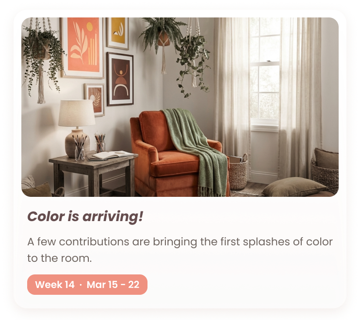
The Hybrid cherry-picked the best of each: the skyline as the emotional anchor at the top of the Hub, a single collective stat line that only goes up, a progress ripple with milestone notches but no percentage label, an anonymous gallery with a private coral dot only Beth can see, and progressive postcards that fill from grayscale to color through the week. Every week gets one. "A Cozy Week" — not "Incomplete."


A feature this complex needed a foundation before it could scale.


Design System Detour
Midway through exploration, it became clear that jumping straight to high-fidelity screens would create a mess — inconsistent spacing, one-off components, colors that drifted between frames. So I paused screen design and invested in building a proper component system first.
36 Studios-specific components, all variable-bound to Venue's design tokens. Identity Card, Milestone Stepper, Avatar Cluster, Milestone Stepper in multiple states, Weekly Postcard in three states, Studio Browse cards, the Vibe Wheel reaction selector — each one built as a reusable instance with auto-layout. No snowflake frames, no hardcoded colors.
The detour cost a day. It saved the rest of the sprint.

The feedback that sharpened everything.
Leadership Feedback
Before locking in final screens, I brought the work to Carmen at Yummy Labs and to sprint peers for critique. The feedback was specific and actionable — it pushed the design past "working" into "right."
The browse experience needed more depth. The gallery needed a reaction mechanic beyond the single Petal Drop. The postcard collection deserved a place in the profile, not just the Hub. And the Hub hierarchy was trying to do too much — six elements competing for attention needed to tighten to four.
Every round of feedback mapped back to Beth's needs. If a suggestion added pressure or obligation, it didn't survive. If it added warmth or clarity, it shaped the next iteration.
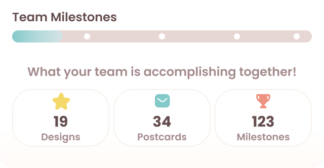
The biggest evolution: the skyline illustration was absorbed into the Weekly Postcard — turning a decorative hero into a collectible artifact that fills as the Studio contributes. The progress ripple simplified into a milestone rewards tracker. And the Hub hierarchy tightened from six competing elements to four: postcard, metrics, gallery, and milestones.
Key Design Decisions
Chosen
All designs shown anonymously. Only Beth sees which one is hers — a small coral dot, private to her. No names, no scores, no rankings.
Rejected
Each design shows the creator's name and star rating. Transparent but risks turning the gallery into a ranking.
The call: Anonymity and the private indicator mitigate the comparison instinct. The gallery celebrates the collective — not individuals.
Chosen
Weekly Postcard that fills from grayscale to color as contributions land, paired with a milestone rewards tracker. The postcard is the emotional anchor — visual proof the Studio is alive. Milestones mark collective achievements without pressure to hit a number.
Rejected
Single progress bar with percentage. Clear but fragile — mid-week dips feel like failure, and a number creates a target that creates pressure.
The call: The postcard fills as a feeling, not a math problem. Milestones celebrate what the group achieved — not what they fell short of.
Chosen
No timestamps. No auto-kick. No absence penalties. The Studio is a persistent home, not a contract. Clean weekly slate on return.
Rejected
'Last active' timestamps, gentle streak counters, 'your team needs you' nudges. Industry standard. Effective short-term.
The call: What we deliberately didn't build matters as much as what we did.
Final Designs
With the design system locked, feedback incorporated, and key decisions resolved — the final screens came together fast. Claude Code handled the prototype build while I directed from Figma.
Outcome&Impact
19 screens
Full feature flow from discovery through weekly lifecycle
36 components
Variable-bound, auto-layout Figma component system
Live prototype
19-screen tappable prototype with Supabase data collection
SDT × JTBD × Octalysis
Psychology-grounded framework connecting player needs to business KPIs
Design sprint deliverable — not a shipped product. Outcomes are strategic. Phase 1 scoped to the smallest version that proves the hypothesis. Connections, player-created Studios, and Seasons are on the roadmap — but only if Phase 1 earns them.
The hardest design decisions weren't about what to build — they were about what to deliberately leave out.
Every streak counter, every "last active" timestamp, every leaderboard we said no to was a choice to trust that warmth could do what pressure usually does.
— Reflection